Table of Contents
Research
Synthesis
Design
Prototype
Next Steps
The Brief
2 week research and design sprint to
make a proposed improvement
Who’s on the Team
Head of Research - Your’s Truly
Research / Design Liaison - Cynthia Huang
Head of Design - Monica Han

Naturally, we started with Research

Analysis
As the Head of Research, conducted a preliminary analysis between Venmo and some of its top competitors. In this case, the biggest differences are not manifested in the features offered but instead the individual user’s experience defined by the look, feel, and tone of the app. In order to gain more in depth insights we would need to perform contextual inquiries for all of the competitors, create journey maps, and compare again.
Because the scope of our project focused on adding or changing a feature for improvement, we decided to save those steps for a future sprint and instead jump into our user research.

Surveys
I worked closely with our Research and Design Liaison to create a survey that would help us to know and understand our users and their relationship with Venmo.
Who are you? When, where, what, how, and why, Venmo?
We tested a pilot, made some tweaks, and sent it out into the world.

Interviews
I based my script off of our survey questions, but kept things flexible. I knew our next task was to synthesize and discover what problem we would be solving, so I wanted to make sure I cast the net wide.
It’s amazing what you can learn when your job in the conversation is simply to ask questions and listen.
Tell me all about it; I really want to know!
THIS IS MY FAVORITE PART!

So what’s the Problem?
Get me to the Affinity Map!
We included the entire team for our initial mapping. Then I spent another day refining our groupings and extracting insights until a problem rose to the surface.
Ok, I take it back…THIS is my favorite part!
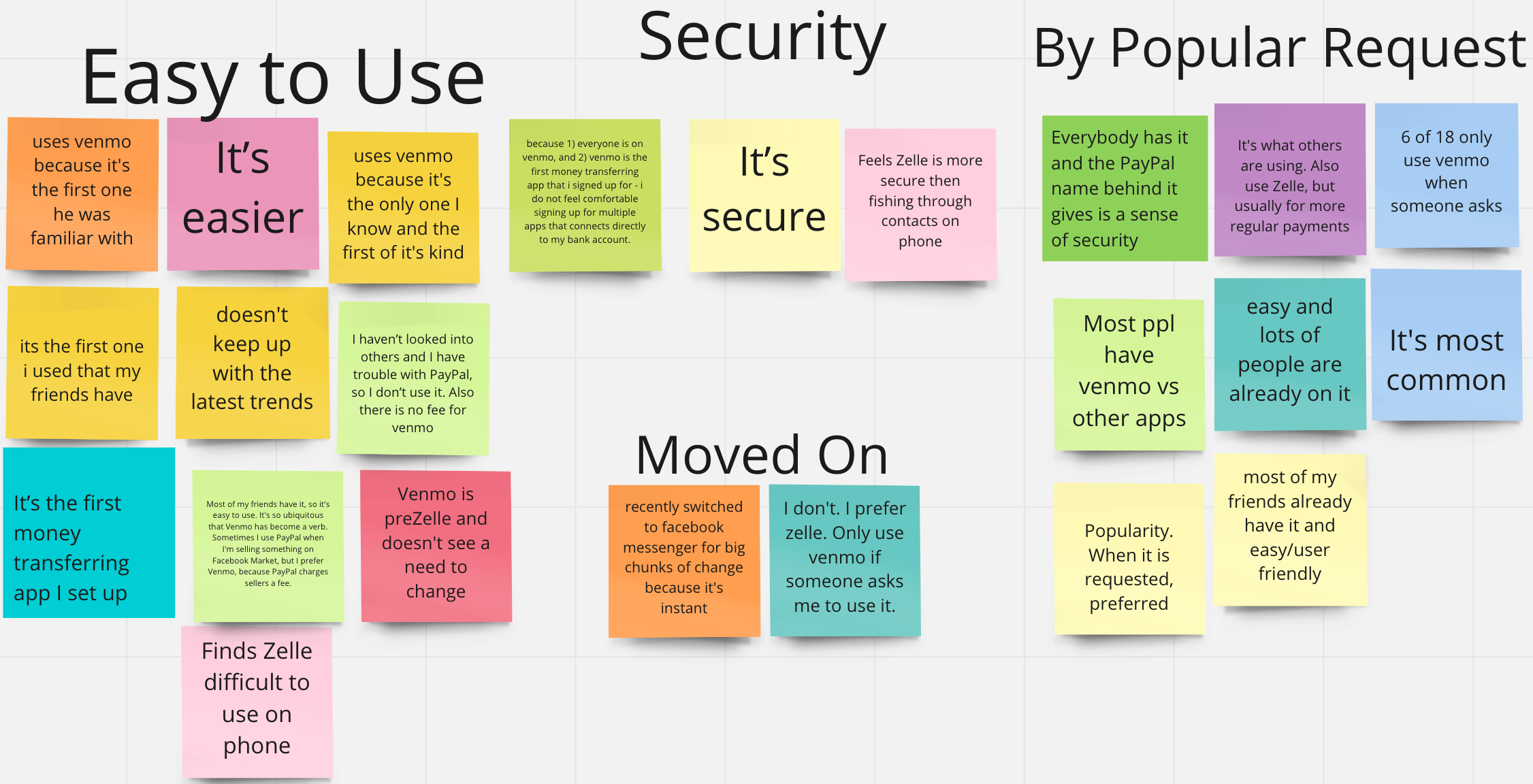
So here’s what we found:
There is a level of trust that comes with being the first.
-While there are a number of money transferring apps out there now most users continue to favor Venmo over the others due to its familiarity and by the fact that it was the first to come out.
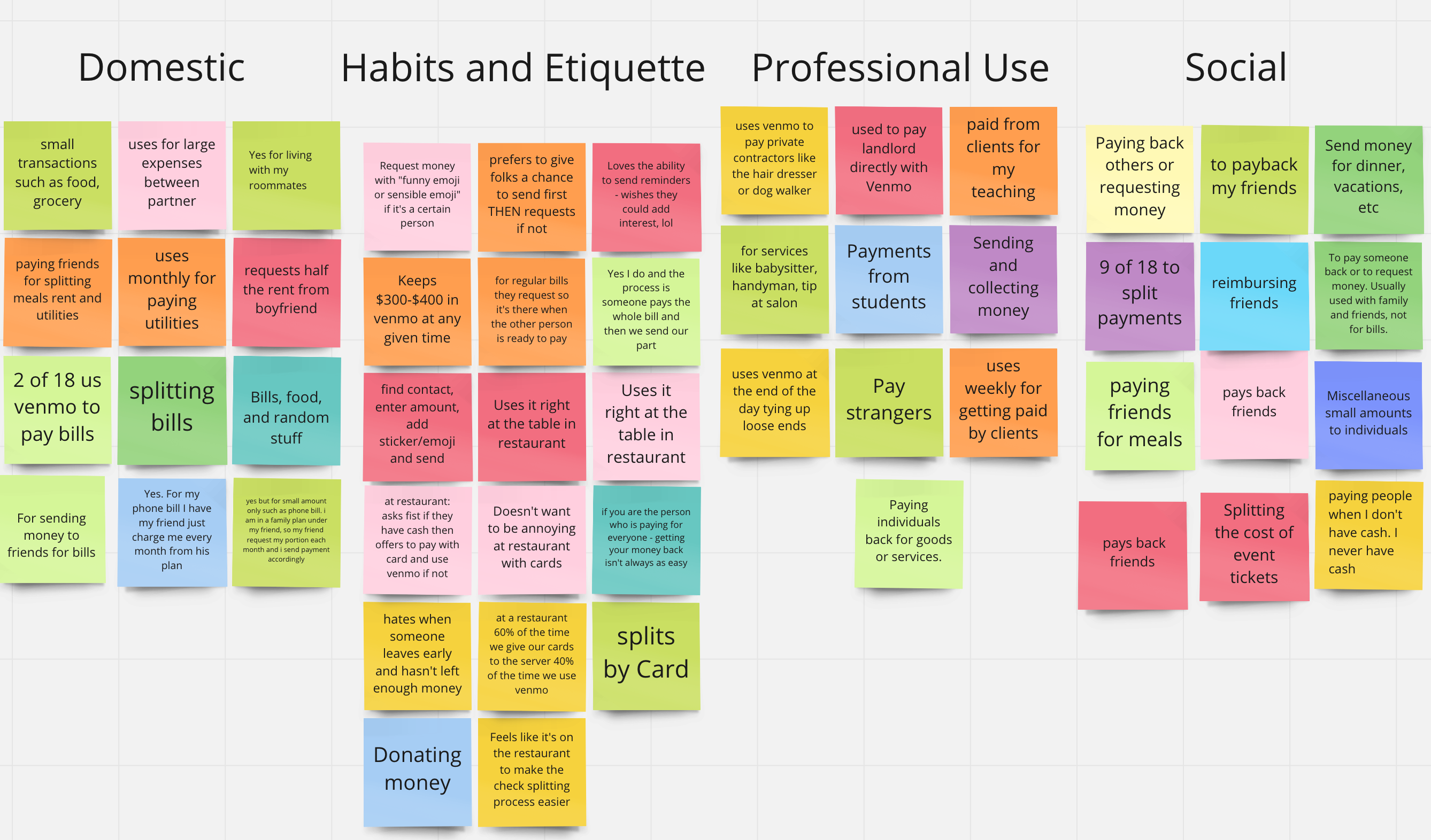
Venmo tends to be the app everyone has in common.
-Even the people who have ventured into using other apps still default to Venmo for common small sum transfers like paying back roommates for household expenses or, most popularly splitting the check after a meal.
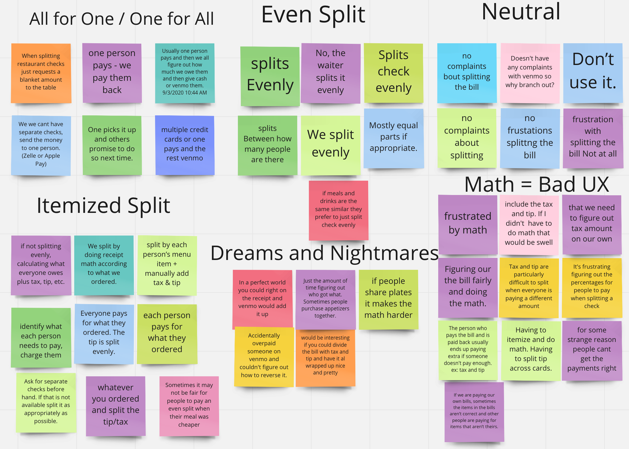
Splitting a check after a meal is where most common pain points occur.
Wait, what’s the Problem?
Our users need an efficient way to divide group expenses on Venmo in order to avoid tedious math and potential miscalculations.
Math is hard. Doing math publicly is anxiety inducing. Even people who are good at math are tired of constantly being depended on in these circumstances.
Venmo is not responsible for this pain point, but they are the common app that is ever present when this situation occurs.
So, what’s the Solution?
We are creating a native check splitting feature in Venmo!
This works in two parts:
The user who “foots the bill” shares an interactive, itemized receipt with their friends.
Then
The friends select their items from the interactive, itemized receipt and pay back the friend who “foot the bill.”

Great idea, now what?

And so the iterative design portion of our project began…….
We excitedly dove into ideations for the user flow and UI for our solution. We began testing early and often making iteration after iteration as we went.
Hold on, maybe THIS is my favorite part.

One small but incredibly important iteration centered around the UX writing. Words are powerful!
We changed “send bill” to “share bill.” Users were getting stuck and unwilling to continue because they weren’t entirely sure of what they were doing, and they especially didn’t want to make a mistake when handling money with friends.
Our prior research around Venmo habits and etiquette supported the change, and our testing proved it successful!

This was a pretty major iterative change that came at the very end of the 2 week sprint. From the very beginning of the design phase the “claim items before sharing” screen was problematic. Our thought was that the primary user would want to “claim” her items off of the receipt before sending it to her friends. Unfortunately, our users kept getting stuck no matter how many tweaks and changes we made to the layout and language.

Finally, it occurred to us. The step was unnecessary! Our users didn’t know what to do because they didn’t see a reason to do it. We were so concerned a bout making things streamlined and fool proof that we ended up overcomplicating the task. It was hard to say goodbye to the step, but we knew immediately that we’d made the right choice. Our users began running through the tests with flying colors!
And, without further ado,
our Prototype
Follow the prompts for the 2 user flows.

You and your friends just enjoyed a fabulous brunch, and you footed the bill in order to simplify the splitting process.
Log in to Venmo, scan the receipt, and share it with your friends.
Pretending some time has passed, check the status of your shared bill in your “incomplete” section.
You know the fries were yours, so you’re not worried about them, but you can send a reminder to whoever had the milk shake.

Your friend foot the bill after brunch, and you need to pay him back.
Log in to Venmo, and check your notifications.
Open the bill, select your milk shake, and pay.
You can see the original receipt if your feel the need to double check.